State Wallet Credentials
Overview
Background
The State Wallet app was designed by the state IT office as a way to store Covid-19 vaccine cards. Since over a million state resident downloaded the app, there was an opportunity to expand the apps use by offering more cards and credentials. Additionally, this would also be a digital service the IT UX team could offer to other state services.
Product Description
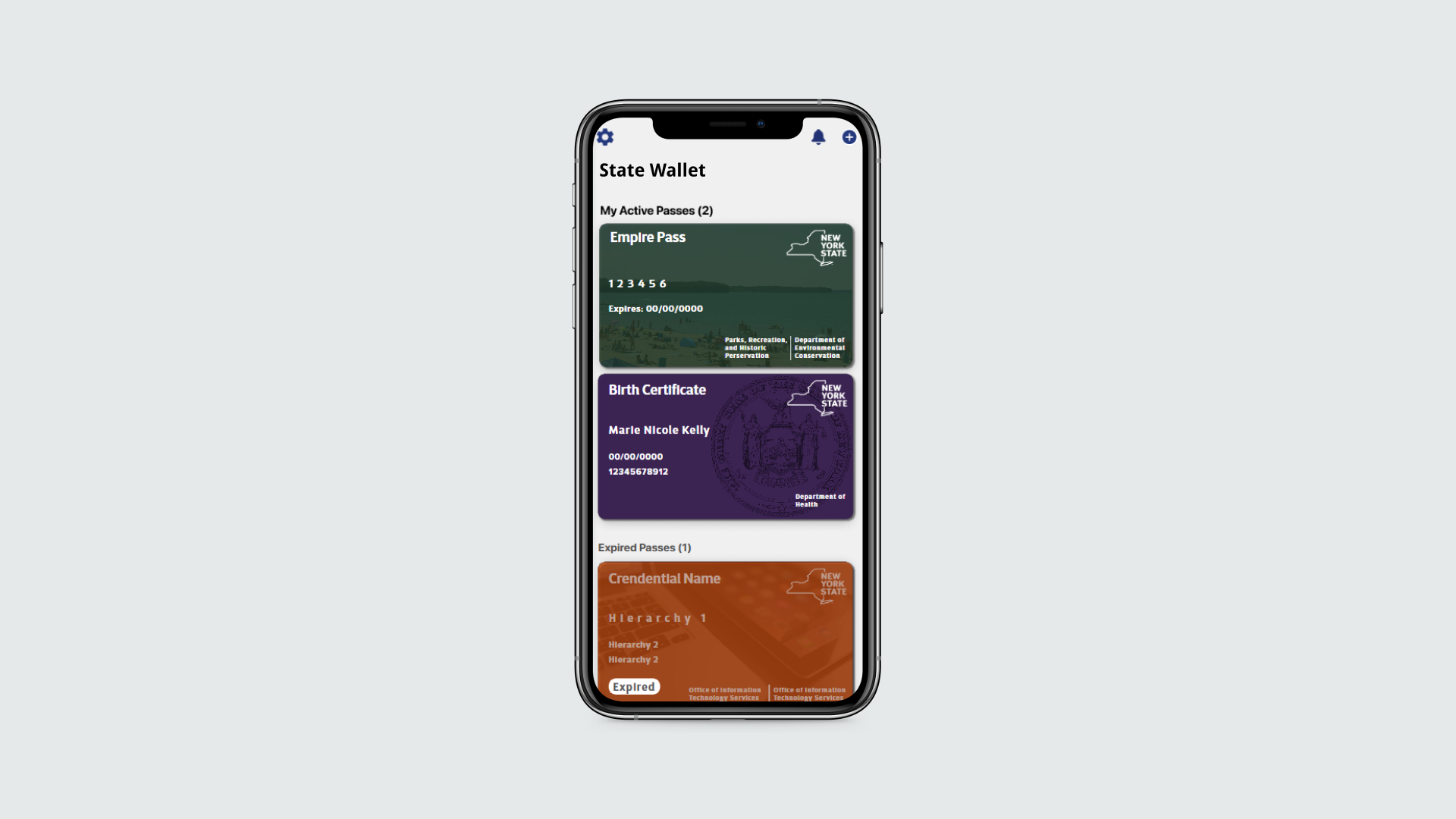
As the State Wallet app’s original purpose became less relevant, it was necessary for the team to shift focus and come up with new ways to use it. With this app credentials such as licenses, identification, parking passes, and even immunization information can be stored and used quickly, easily, and securely by state residents.
My Roles:
UX Design, UI Design, Wireframing, Prototyping
Tools Used:
Mural, UXPin
Design Process
Discovery
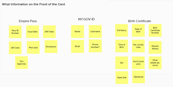
The type of information shown on the credentials varied based on the agency and project associated with it. Based on information gained from stakeholder meetings, requirement documentation, and physical versions of credentials, data points were listed and organized within a Mural whiteboard. We specifically looked into what information absolutely had to be included on the credentials and where it was best to display it, “front of card” or “back of card”.

Comparatives
Comparatives of other wallet style applications were collected for reference. Features such as status, fraud deterrents, layout were of particular interest to the team.

Mockups
Lo-Fidelity Front of Card
Using the insights gained from the list of data points that would be featured in future projects and the patterns from the comparative, a lo-fi mockup of the generic credential was drafted. Special attention was given to the layout as it was imperative that features such as the agency name, state identifier, and most important data points were present on the front.

Lo-Fi Back of Card
Since the back of the card contains the bulk of data needed to be shown to the users, it was decided that it would be best for this part of the card to have two different states, default and extended. The default state was to have the most important information listed and the extended state was to be used on credential that had more than 5 data points.

Hi-fidelity Front of Card
Since the orange assigned to administration agencies is one of the most difficult to design around, it was used to mockup the generic credentials to test out different potential layouts. Mockups of potential projects were designed using the horizontal label and data point hierarchy as it saves space on the card.


Some credentials may require different statuses, such as expired or valid, therefore it was necessary to test out how semantic colors on the status pill would work and how different states should be displayed. In addition to that, there was a chance that professional licenses could be made into a card, so location of photos had to be considered.


Hi-Fidelity Back of Card
Similar to the front of the card, mockups that consisted mainly of the agency colors and neutral versions were created. Thought was put into where the QR codes, statuses, and instructions would be displayed and whether or not those could be configured based on the different projects.


The extended version required a way to group the data points, so sectioning was necessary. Mockup versions with section breaks and section titles were designed to account for credentials that contain large amounts of data. Once again two different color ways were mocked up to see how the agency colors could be used.


Future Improvements & Lessons Learned
While designing the credential configurations, the opportunity to work on a project for the department of environmental conservation started. Using the insights from that project resulted in some changes to the location and size of the QR code and to the layout of the front of card (case study coming soon).
Through this project I was able to understand how to rapidly come up with various design options. This type of designing isn’t always possible but it was nice to explore different ideas in a low stakes way. This project was the perfect way to prepare for the credential projects that followed after it and to show to stakeholders to garner a shared understanding of how the credentials could be configured.